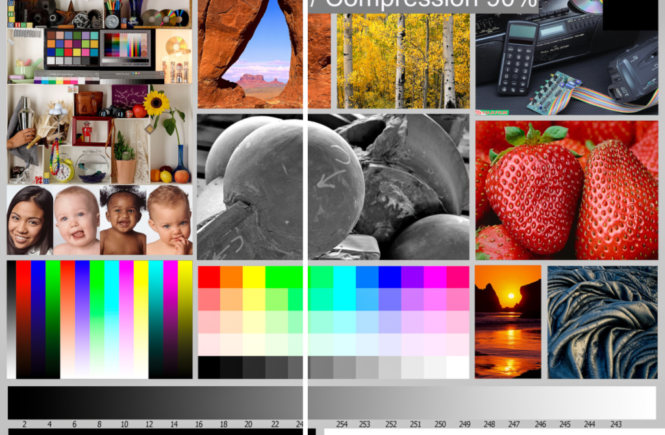
The goal of this article is to understand the parameters that impact the compression applied by Facebook when you upload an image and, more importantly, to show the visual impact.
Facebook basic recommendations
The Facebook recommendations for HQ Images are :
- 2048px (max) in the longest side.
- sRGB color space.
I’ve followed these recommendations excepted for one JPG uploaded with a max size of 3600px.
Test preparation and setup
The JPG have been created with Adobe Lightroom Classic 2020 and the source image is a test image (TIFF – 3600 x 2700 px – 42 MB).

All the files are available here.
The Facebook album is available here.
I’m using a Mac Book with a BENQ SW2700PT calibrated screen (27″ – 2560 x 1440 pixels – pitch 0,21 – 108 ppp – Full AdobeRGB color space).
The full size image is bigger than my screen but the 2048px images can be perfectly visualized at 100% magnification.
I’ve created four different JPG, uploaded them as photos in an album and as photos in a post. After that I’ve downloaded them on my MAC to compare them.
Factual results
I’ve not found a way to get the compression used so I’m assuming that the file weight is a good indication of the compression level used. I know it’s not fully correct but as this is the same image for all the JPG it must be close to the reality.

Some findings :
- Limit the size to max 2048px.
- The compression is slightly lower when the image is added to a post rather than to an album.
- The original compression (70 or 90%) has no impact on the compression added by FB.
- It’s quite difficult to identify a clear pattern of the compression used. Some randomness seems to appear but uploading/downloading an image a 2nd time gives the same weight.
Visual Results
The most important part as the objective is to offer the best viewer experience and not doing pixel peeping.
All the comparisons are screen scrapings in order to mimic as best the viewer conditions meaning you in front of your screen in Facebook. Keep in mind that I’m using a huge qualitative screen and that the differences will be less visible on a smartphone or tablet screen.
Click the image to open a full size live comparison on the image, thanks to Revision. Drag the grey vertical line.
Full JPG versus 2048px
As the biggest image size uploadable in Facebook is 2048px this first comparison is the full JPG size (left) versus the 2048px compression 90% (right).
Of course the image size is adapted to the screen size by your web browser and/or application used. But again we’re not in a pixel peeping exercise.

As you can see there are no real differences between the images. I’ve even the feeling that the 2048px looks sharper on my screen than the full size image.
2048px compression 90% original (Left) versus downloaded (Right)

Again no visible differences, even in the shaded black to white horizontal bar.
Full Size compression 90% original (Left) versus downloaded (Right)

Even there Facebook is doing a decent compression job.
Facebook Album
When looking at the album they are subtle differences in the transition from black to white with some bandings when the original compression is higher and/or the size greater than 2048px.
Conclusions
Facebook is doing a very decent job of showing your pictures.
My recommendation : Save your JPG with 2048px for the longest side / sRGB / JPG Compression 90% (not lower).
